A product meeting has been circling the same slide for half an hour. Engineering is discussing dependencies, design is describing a user journey, and product is defending a deadline. Everyone understands the words, but nobody is working on the same problem. Then someone draws three boxes, connects them with arrows, and marks the disputed handoff with a question mark.
The room changes immediately. The disagreement is no longer hidden inside polished language. The team can see whether it concerns scope, sequence, ownership, or an assumption nobody has tested. That is the practical value of visual problem solving. It gives difficult ideas a shared surface where people can inspect, rearrange, challenge, and improve them.
I've seen the same shift during candidate screens. A senior engineer receives a vague prompt about designing an onboarding system and starts talking through services, queues, and databases. The answer sounds experienced, but the interviewer can't tell which user problem the architecture is solving. When the candidate draws a simple journey from account creation to first successful action, the missing decision becomes obvious: the team hasn't agreed on what “successful onboarding” means.
A visual doesn't solve the problem by itself. It changes the unit of discussion. Instead of debating a sentence such as “we need a smoother activation flow,” the group can point to a step, a handoff, or a failure state. Someone can ask why the user moves backward. Someone else can mark where the system needs an external dependency. The conversation becomes inspectable.
That distinction matters because people don't all interpret abstract language in the same way. A product manager may hear “simplify checkout” as reducing form fields. A designer may hear it as clarifying hierarchy. An engineer may hear it as removing synchronous calls. A journey map or annotated wireframe gives those interpretations somewhere to meet.
Practical rule: Draw the disagreement before trying to resolve it.
Visual problem solving also exposes when a team is using the wrong representation. A picture may help with spatial relationships but distract from a combination problem. Research involving graduate students solving probability problems found that successful representations varied by problem type, with reorganized information, outcome listings, and tree diagrams helping combination problems more than pictures. The foundational study of visual representations in probability problem solving is useful precisely because it rejects the lazy idea that every problem improves when someone adds graphics.
That's why presentation polish comes later. If you're preparing a workshop or review, practical tips for visual presentation aids can help you make an artifact readable, but readability isn't the starting point. First choose a structure that exposes the relationship the team needs to evaluate.
The rest of this guide is a working toolkit for product, UX, engineering, and interview settings. It focuses on what to draw, when to draw it, and how to tell whether the artifact is clarifying the problem or merely decorating it.
Visual problem solving means putting a problem into a spatial form that people can manipulate together. The medium might be a whiteboard, a sheet of paper, FigJam, Excalidraw, Figma, or a diagram in a pull request. Boxes, arrows, rough sketches, annotated screenshots, timelines, matrices, and state transitions all qualify when they represent relationships that matter to the decision.
A bulleted list usually doesn't. A list can organize language, but it doesn't show sequence, proximity, dependency, containment, or branching unless the reader performs that translation mentally. A visual representation makes at least some of that structure explicit.
The cognitive mechanism is easier to understand as a workbench. Holding a complicated problem entirely in your head is like carrying every component while trying to assemble a machine. Externalizing the problem places the parts on a bench. You can move one, compare two, draw a missing connection, remove a redundant piece, and return to the original arrangement without relying on memory alone.
Classroom evidence supports this active interpretation. In a study of fourth-grade students, researchers presented four problems verbally and then visually while keeping the operational steps unchanged. Visual presentation reduced unanswered questions by 11% and increased correctly answered questions by 12%, while student-generated drawings contributed more to achievement than visuals supplied in the question. The study of visual presentation and non-routine problem solving points to an important workplace lesson: asking people to construct a representation can be more valuable than showing them a finished graphic.
A useful artifact usually performs at least one of three jobs:
This isn't the same as data visualization. A dashboard communicates measured data, while a problem-solving sketch helps a team reason about what might happen, what should happen, or what needs investigation. It isn't the same as interface design either. A wireframe can be a design deliverable, but during discovery it's also a thinking instrument for testing hierarchy and interaction before visual polish creates attachment.
Whiteboarding as a hobby produces attractive surfaces with little decision value. Effective visual problem solving is more disciplined. Every mark should either represent the problem, expose a relationship, record an assumption, compare an option, or establish a next action. If a shape does none of those jobs, remove it.
Teams often reach for the wrong visual tool because they treat “draw it” as a complete instruction. The right choice depends on what the group needs to understand. A rough sketch supports divergent thinking. A journey map reveals experience over time. A wireframe settles interaction structure. A technical diagram makes dependencies and failure paths explicit.
| Method | Best For | Skip When |
|---|---|---|
| Sketching | Early ideation, interview warm-ups, and uncertain product concepts | The team has already agreed on the structure and needs implementation detail |
| Journey maps | User flows, onboarding, handoffs, friction, and cross-functional alignment | The problem concerns internal service dependencies rather than user experience |
| Wireframes | Layout, interaction hierarchy, states, and scope discussions | Visual styling or brand expression is the actual decision |
| Architecture, sequence, and state diagrams | Dependencies, causality, API boundaries, and system behavior | The system is simple enough to explain accurately in a short paragraph |
Use sketching when the team doesn't yet know what the answer looks like. A set of small screens for a new onboarding concept, each showing a different first-run experience, gives people options to react to without implying that one direction is finished.
Skip sketching when the debate concerns exact copy, accessibility behavior, or production constraints that require more formal detail. A rough box with “verification step” won't settle whether the user can recover from a failed identity check.
Keep each idea small. Six thumbnail sketches usually create a better discussion than one elaborate screen because the team can compare patterns instead of defending a single investment.
Use a journey map when time, handoffs, and emotional or operational friction matter. For a developer onboarding flow, map the path from invitation to first merged change, then mark where the new hire waits, asks for help, changes tools, or receives unclear feedback.
Skip it when the core issue is a system dependency with no meaningful user journey. A journey map won't explain why two services disagree about ownership of an event.
A useful artifact combines the user's actions with the backstage conditions that enable them. Put “reads setup guide” above “repository access pending” and the team can see that the apparent documentation problem may be an access workflow problem.
Use wireframes when the scope is sufficiently understood but layout or interaction remains contested. A low-fidelity account recovery screen can settle whether the primary action is visible, what information appears first, and how an error state returns the user to progress.
Skip wireframes when the team is still debating who the user is or what outcome matters. Designing screens before framing the problem encourages premature commitment.
Wireframes should preserve uncertainty where uncertainty remains. Label an unresolved component “permission model TBD” rather than inventing a polished control that makes an open decision look settled.
Use architecture, sequence, and state diagrams when more than two moving parts interact. A sequence diagram can show a mobile client, API gateway, identity provider, and notification service in the order they communicate. A state diagram can expose what happens after a payment is authorized but before fulfillment is confirmed.
Skip a diagram when the relationships are trivial. A dense architecture drawing for a single request path creates maintenance work without improving understanding.
People also learn these habits through structured play. For teams designing workshops or interview practice, fun group challenges for schools offer examples of how constraints, collaboration, and visible progress can turn abstract problem solving into an observable activity. The same principle applies at work: choose an artifact that lets participants act on the problem rather than merely listen to an explanation.
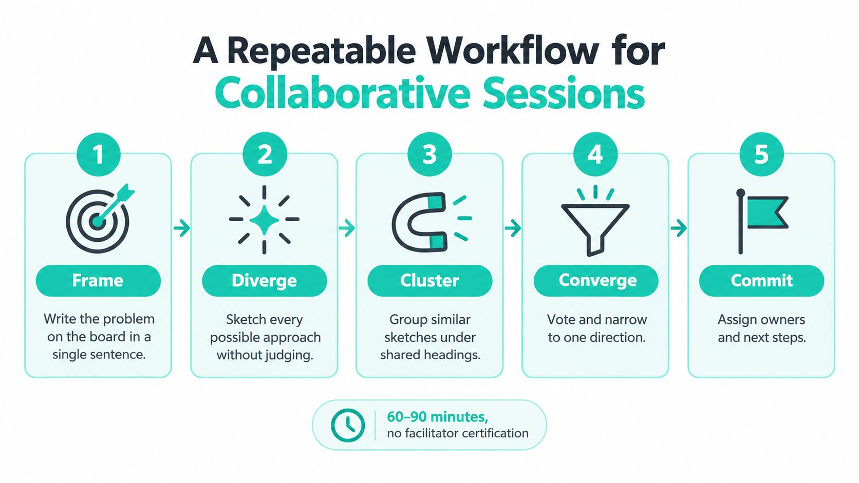
A productive visual session doesn't require a professional facilitator. It needs a clear owner for each stage, a visible time limit, and an artifact that survives after the meeting. A product manager can own framing, a designer can guide the initial sketches, an engineer can check system boundaries, and the eventual decision owner can record the commitment.
Start by writing the problem in one sentence. Circle ambiguous nouns such as “activation,” “platform,” “quality,” or “real time.” Ask what each term means in this decision, then write the answer beside it.
The output is a framed problem, not a solution. If the sentence already contains a preferred feature, rewrite it around the user or system outcome.
Give everyone four minutes of silent sketching. Each person should draw a possible flow, system shape, or intervention without presenting it while others work. Silence prevents the loudest voice from becoming the default direction before the group has generated alternatives.
Collect the sketches on one surface. Don't polish them yet. The point is to make different assumptions visible.
Cluster similar ideas, then place the clusters on a 2x2 matrix with effort on one axis and impact on the other. The axes don't need numerical precision. They need shared definitions and enough separation to support a decision.
Give participants dots or another simple voting mechanism. The decision owner should explain what the vote informs and what it doesn't decide. Voting identifies energy and perceived value, but it doesn't replace technical review.
Move the selected cluster to a fresh board. Turn it into a rough wireframe or system diagram. Call out API boundaries, ownership, external dependencies, and unresolved assumptions directly on the artifact.
The designer or engineer closest to the decision should draw, while another participant records questions. Keep the representation rough enough to change.
Trace three edge cases on the spot. Pick cases that attack the chosen direction, such as a duplicate request, an incomplete profile, a slow dependency, or a user who abandons and returns.
End by committing the final artifact to the team repository with a short decision note. Include the selected direction, rejected alternatives, open risks, owner, and next action. A diagram that disappears with the meeting has helped the conversation but hasn't yet improved the system.
For a hiring team, the same workflow can fit a technical screen. The candidate frames the prompt, sketches independently, explains the selected path, and tests an edge case. Interviewers can evaluate reasoning without demanding a particular drawing style. Teams refining the first weeks after hiring can also connect the session artifact to their new-hire onboarding process, so the diagram becomes a reference for context rather than a disposable interview exercise.
Good artifacts aren't defined by artistic quality. They're defined by whether another person can identify the decision, follow the relationships, and add useful information without rebuilding the whole thing.
The weak version is a whiteboard covered with crossed-out arrows, isolated feature ideas, and several circles labeled “users.” It records activity but not meaning. The reader has to reconstruct which ideas are alternatives, which are dependencies, and which one the team considers most important.
The stronger version groups the ideas into a labelled affinity diagram. A clear north-star outcome sits at the top, related concepts sit beneath it, and unresolved questions have a distinct marker. The quality separating the two is hierarchy. The good artifact tells the reader where to start and how the parts relate.
Ask whether your board has an obvious reading order. If not, add headings, spatial grouping, or directional cues before adding more content.
An over-detailed Figma wireframe can contain gradients, final typography, polished icons, and every validation message. It may look close to launch, but that fidelity makes feedback expensive. Stakeholders hesitate to challenge the layout because the artifact appears to represent a large amount of completed work.
A low-fidelity alternative shows the page structure, the primary action, and the error state. It leaves visual styling open while making the interaction decision concrete. The quality here is restraint. The artifact contains enough detail to answer the current question and no more.
A visual should make the next disagreement easier, not make the previous decision harder to revisit.
A cloud of services with arrows in every direction can resemble a system while hiding its behavior. It doesn't tell the reader which request starts the sequence, where data changes hands, what happens when a dependency fails, or who owns a boundary.
A sequence diagram creates a different reading experience. It places actors in order, draws request boundaries, annotates latency budgets, and marks failure modes. The quality is boundary clarity. The diagram communicates not just what exists, but when and under what conditions it interacts.
A controlled experiment using isomorphic versions of the card game SET found picture-based trials were completed significantly faster than word-based trials, with a presentation effect of F(1,16)=158.913, p<0.0001. The research on visual encoding and problem solving supports a narrow conclusion: a representation can reduce translation and search when it exposes task-relevant structure. It doesn't justify adding decorative graphics.
Use this checklist before sharing an artifact:

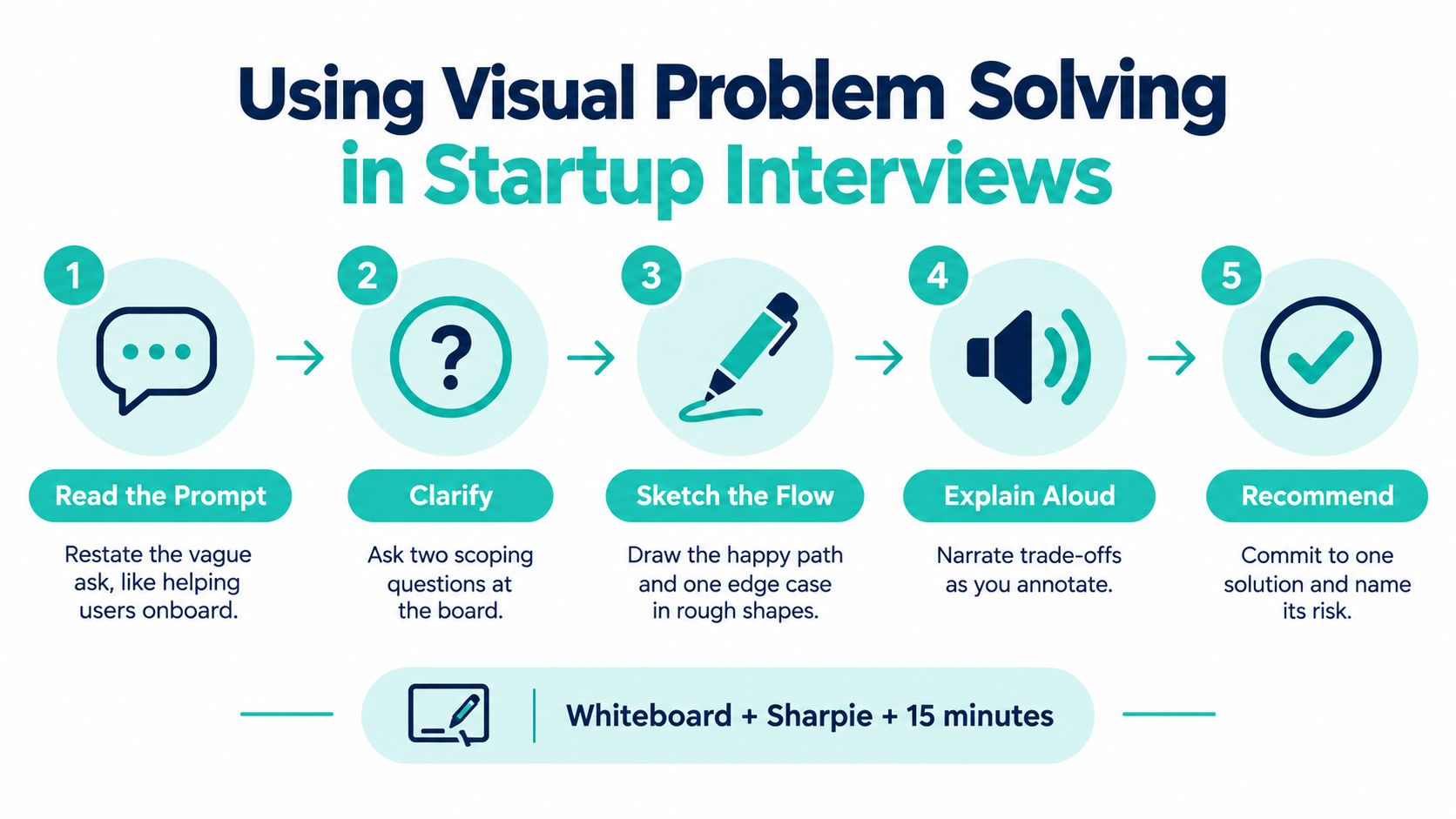
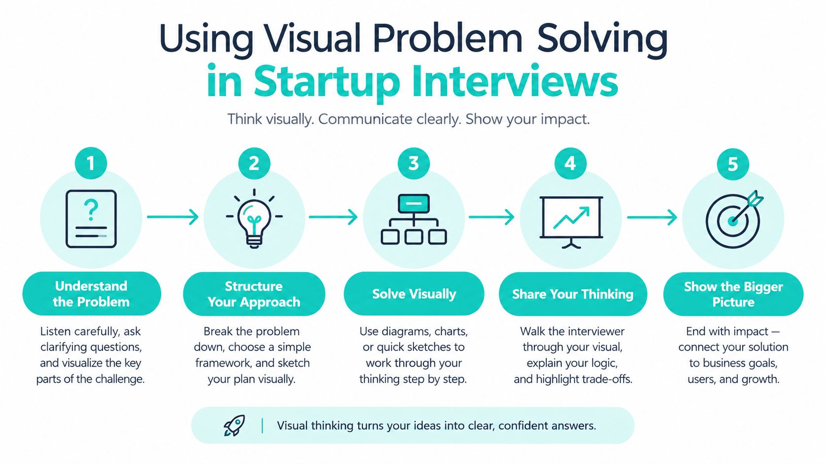
Startup interviews often begin with a vague prompt, a whiteboard, and a Sharpie. “How would you help users onboard faster?” sounds open-ended, but the interviewer is usually testing how you turn ambiguity into a tractable problem.
Before drawing, restate the prompt as a user goal. For example, ask whether the goal is helping a new account reach a first successful outcome, helping an administrator configure a team, or reducing time to a completed workflow. Then ask clarifying questions about the user, the success condition, and the relevant constraints.
Draw one horizontal axis from signup to first value. Use a small number of boxes. Mark the point where the user might hesitate, abandon the process, or need help. Don't begin with database tables or a polished screen. The first drawing should prove that you understand the experience being improved.
If the interviewer changes the constraint, update the diagram rather than starting over. Cross out the affected assumption and redraw the smallest part that changes.
For a system question, switch to boxes and arrows. Label the arrows with trade-offs such as “faster response, stale data risk” or “stronger consistency, more dependency latency.” Asking questions out loud shows that you're not hiding uncertainty behind confident architecture.
Use the diagram to separate the happy path from exceptions. A candidate who draws only the successful flow may miss duplicate events, retries, permissions, partial completion, or external service failure. One clearly marked edge case is often more informative than a page of components.
After the discussion, annotate the sketch with the metric you'd monitor, the largest risk, and what you'd prototype during the first week. The metric might be a behavioral outcome rather than a made-up target. The risk could be poor data quality, user confusion, or an integration that makes the proposed flow fragile.
Interviewers generally want to see how you handle ambiguity, commit to a direction, and expose trade-offs. They don't need architectural perfection from a short session. They need to follow your reasoning and see where you'd validate the answer.
Remote interviews work the same way with FigJam or Excalidraw. Keep the canvas bounded, use a consistent shape vocabulary, and narrate every important change because the interviewer may not see your cursor movement clearly. Send the final frame only after you've labelled assumptions and open questions.
A candidate shouldn't treat the whiteboard as a performance stage. It's a shared reasoning surface. Examples of how teams rethink interview exercises, including reimagining the design interview, reinforce the value of evaluating how people frame and communicate decisions rather than judging whether they produce a beautiful artifact.
One caution matters more as teams use multimodal AI to interpret diagrams, screenshots, and charts. A visual answer can look plausible while misreading a relationship or physical constraint. Research on visual reasoning systems reports accuracy ranging from near chance to 78% on a benchmark built from 701 authentic primary-school questions, and recommends expert oversight before treating generated feedback as reliable. The Frontiers research on multimodal visual reasoning supports a practical interview rule: use AI to generate alternatives or identify questions, but verify every important conclusion against the original artifact.
The first failure happens before the marker touches the board. Someone starts drawing a solution before the team agrees on the problem, so every later discussion becomes an argument about the sketch. Write the user, outcome, and constraint first. If those three elements aren't clear, keep framing.
The second failure is over-detail. A finished-looking artifact blocks feedback because people confuse visual polish with decision quality. Use the least detailed representation that can answer the current question, then increase fidelity only when the next decision requires it.
A subtler mistake is treating a diagram as finished once the meeting ends. Systems change, ownership moves, and assumptions expire. Add a date or revision note when the artifact informs architecture, onboarding, or a cross-functional decision. The point isn't bureaucracy. It's helping the next person distinguish current behavior from historical reasoning.
Research on self-regulated diagram use found that students created diagrams proactively in 72% of observed cases and reactively in 28%. The study of proactive and reactive diagram use gives workplace teams a useful habit: draw when dependencies, sequences, categories, or trade-offs first appear, not only after confusion has already spread.
Before sharing any visual, ask:
The last question matters. If every idea remains on the board, the artifact records possibility but not judgment. A strong visual preserves the selected path, the meaningful alternatives, and the reasons for rejecting them.
Accessibility belongs in this audit from the beginning. A diagram that only exists as color, position, or visual shape excludes teammates who use screen readers or cannot see conventional whiteboards. Research on accessible visual communication identifies the need for equivalent structured, tactile, audio, or text representations, while a review of inclusive graphic and workplace design highlights sensory accessibility as an area that still receives too little attention. Provide a text version with relationships, priority, uncertainty, and changes preserved. That discipline often improves the artifact for everyone.
Underdog.io connects software engineers, product managers, designers, and other tech professionals with curated startups and high-growth tech firms through a candidate-centric hiring marketplace. If you want to bring clearer reasoning and stronger collaborative habits to your next role, visit Underdog.io and explore its selective opportunities.